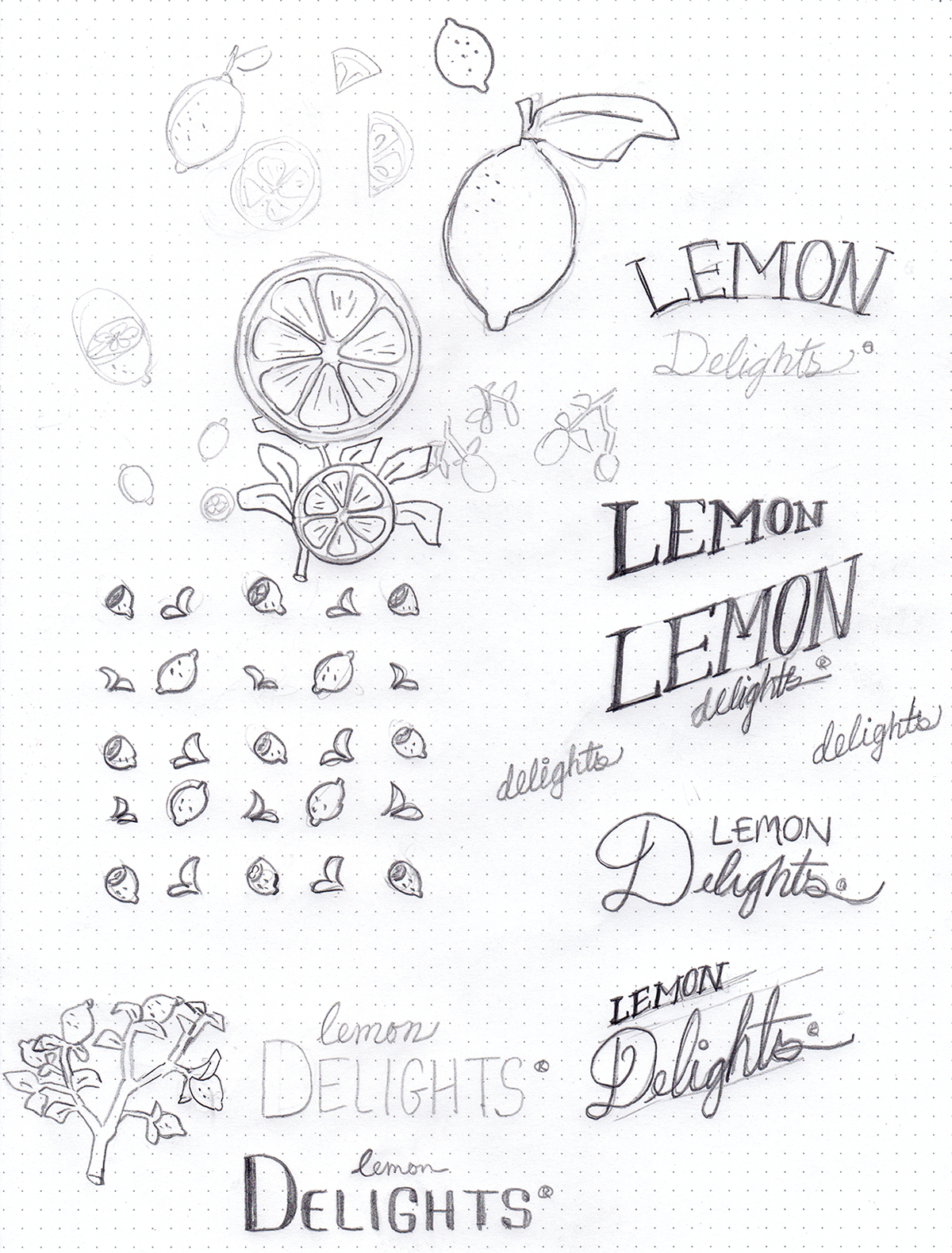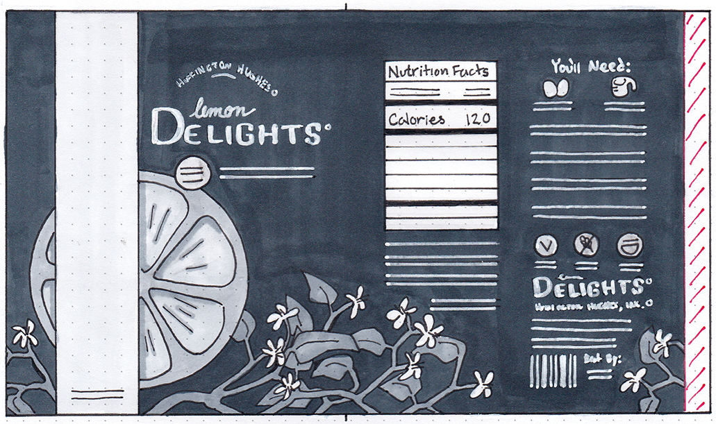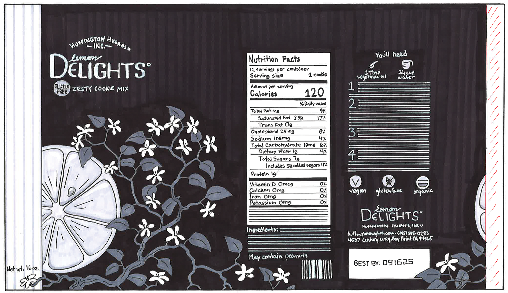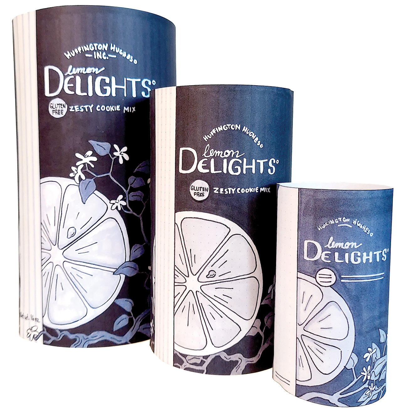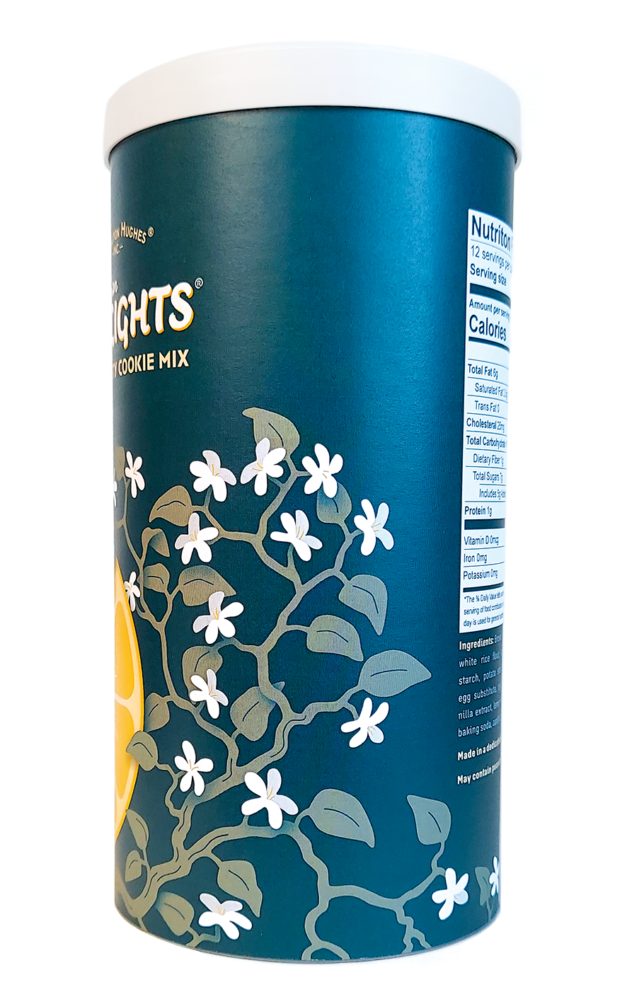
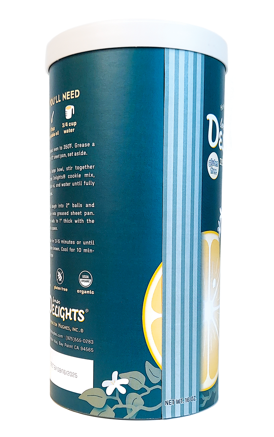
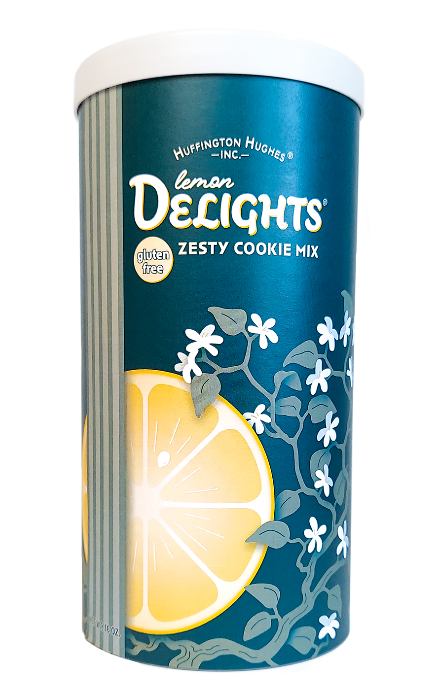
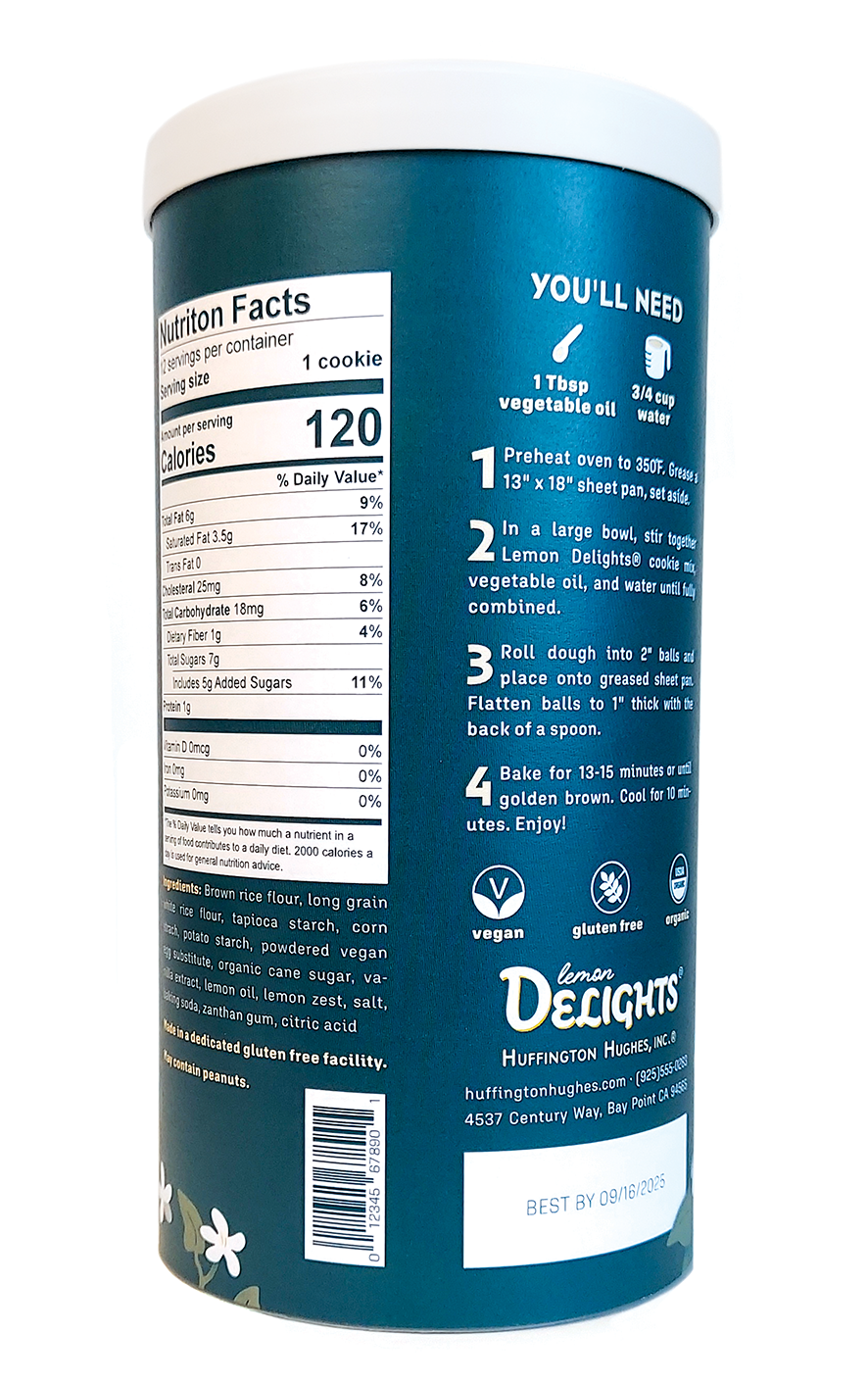
Cylindrical packaging is deceptively simple. While this project was technically just a rectangular label, it provided plenty of problems to be solved — designating front and back faces, consideration of curved surfaces' effect on design, hand crafting a nutrition label, and working efficiently in a two-color space.
After acquiring a cylinder, I measured it and began working around that aspect ratio. I had a couple other good ideas, but ultimately settled on this one because it was the most visually striking of the three. I refined my handwork before digitizing my design, then carefully chose two spot colors. I wanted to overprint them to create the impression of a third color, so my choice was greatly influenced by the quality of the "third color" produced.
Digital print mounted on plastic canister; 8.25" x 4.125"
2024 SLCC Juried Student Art Show
Participant
